
Sign
An electronic signature product built in Nouakchott for businesses, schools and individuals: send a document, have it signed from a phone, keep the proof. I audited the live product by using it as a real customer, then redesigned the full journey, from sending to the proof certificate, as a system a developer can build without guessing.
From test to handoff.
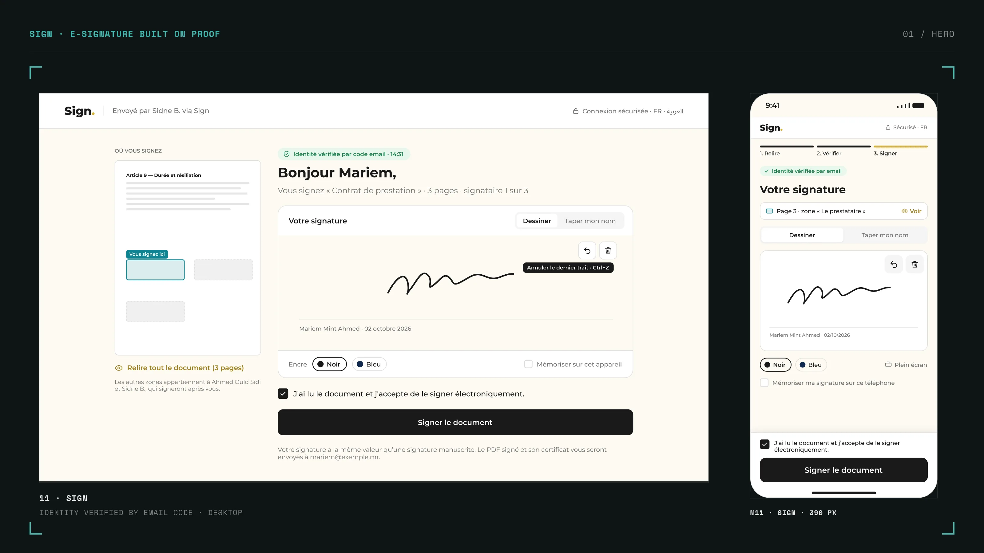
A signature is only worth what it can prove.
Sign already worked: a document could be sent and signed in minutes, paid in MRU with local wallets. But the journey had grown feature by feature. The public site and the app shared the same shell, a template could leave with its fields still empty, and the signing page could say "identity verified" when no check had happened. For a legal product, each of these is more than friction: it weakens the proof the customer is paying for.
In e-signature, the interface is part of the evidence. If the screen overstates what happened, the proof does too.
A heuristic review, then the product used for real
I reviewed every screen against Nielsen's 10 heuristics, then stopped reviewing and started using: I sent real documents, signed them as the recipient, and read the PDF and certificates that came out. The tests found what screenshots never show: a template signed with 8 empty fields, an SMS that failed only when the signer reached it, and a raw error code shown to the signer.
Three test rounds, and an audit that corrected itself
Each new round of captures was checked against the audit, finding by finding. Three findings turned out to be wrong and were withdrawn, one was downgraded, and others were widened. The audit kept a visible trace of every correction, because a document that hides its mistakes is hard to trust.
One page for a founder with no time
The full audit is detailed and technical. The founder needed four points and a reason to meet. I wrote a one-page summary in plain language, with no heuristic codes and no severity scale, and kept the full audit for the working sessions.
Questions before screens
Some answers were not mine to invent: who pays for an SMS, what the unlimited plan covers, whether templates carry their own signature zones. Each became a written question for the client, and each answer changed the design: "the sender always pays" is why a signer can never trigger a paid SMS.
The audit was wrong three times. The tests fixed it.
My first read of the homepage came from a tool that doesn't run animations: the live counters looked like zeros, so I reported them as broken. A partial screenshot made me write that signers couldn't see the document before signing. They could. Each time, a new real test overturned the claim, and the finding was removed from the audit and from the summary sent to the client.
A finding I can't reproduce isn't a finding. It's a guess with a severity score.
One rule for every screen: the interface never claims more than the system can prove. Nothing is invented without an argument: an observed problem, an existing behavior, or an industry standard.
Prevent the error instead of reporting it
Required template fields block the send and show live in the document preview. Bulk sends preview every row before anything leaves, and flag a name that looks like an email. A duplicate email is caught in the field, not after the signatures have been placed.
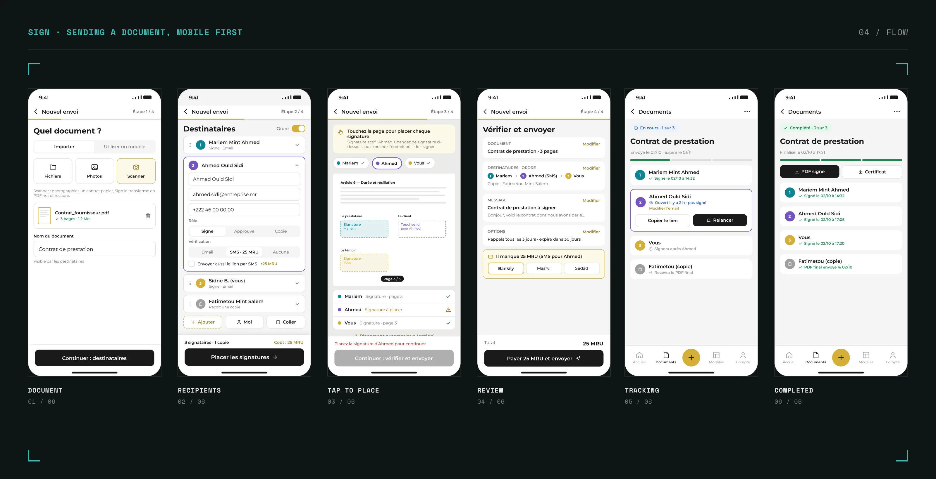
Three honest ways to verify a signer
A code by email or SMS, an identity document through the client's own KYC service, or no verification, shown as such. The badge on the signing page matches what actually happened, and a failed SMS falls back to email with a neutral message.
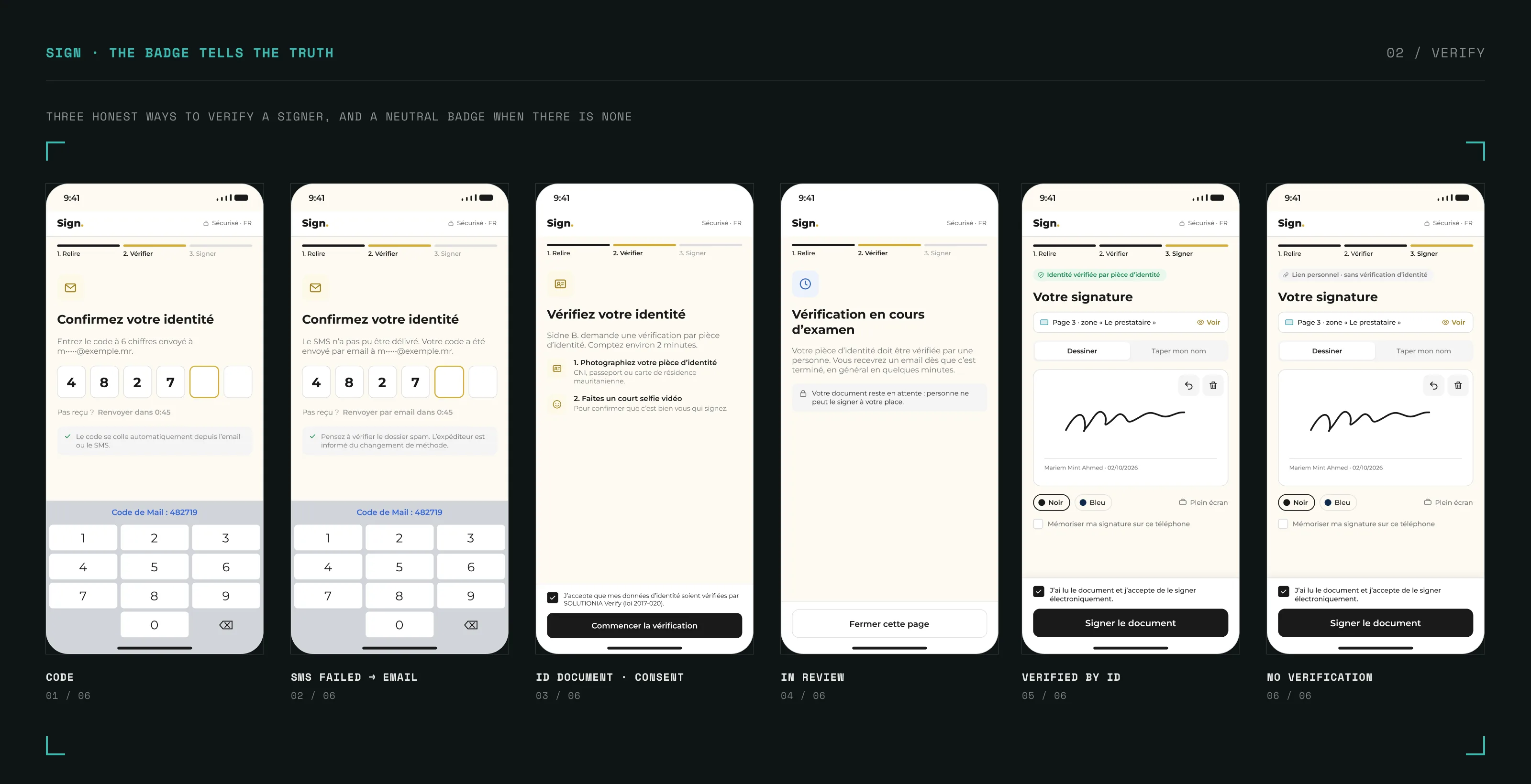
A certificate a court can read
The proof certificate was redesigned as an A4 document: clear sections, readable dates in local time, signers numbered in order, an audit trail, and two hashes named without ambiguity, with only one marked "use this to verify".
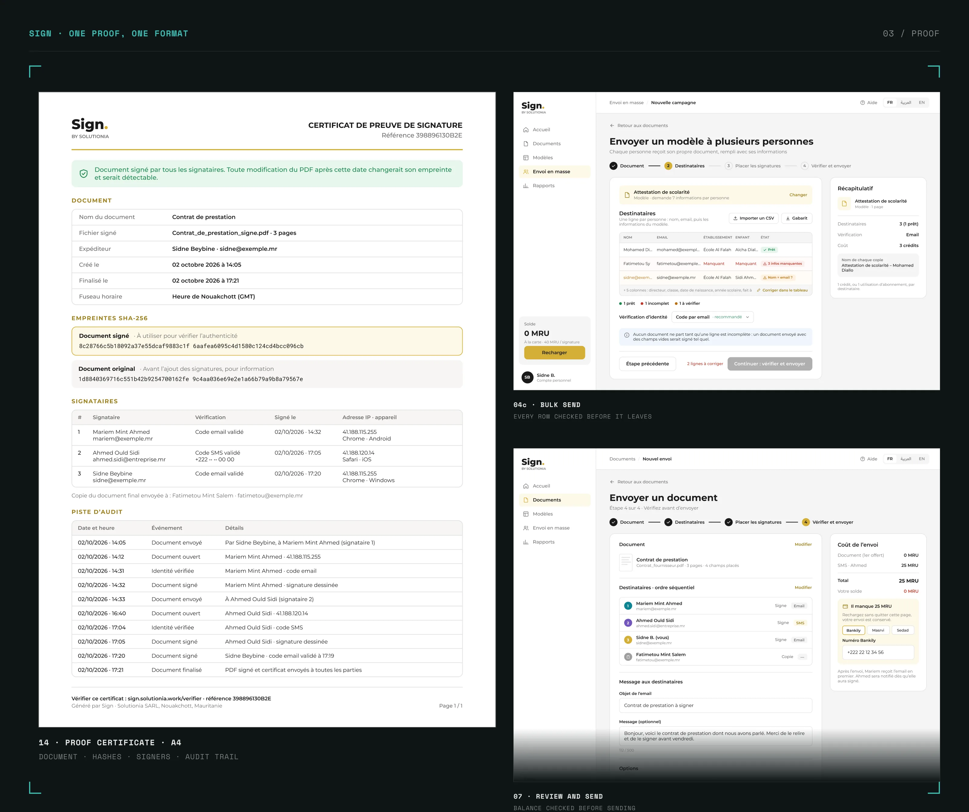
Mobile first, because that's where signing happens
Sign targets the general public, and many users rarely touch a computer. Every desktop screen has its mobile version beside it, except the certificate, which stays a fixed A4 PDF so there is only one version of the proof. This priority is a product decision, still to be confirmed by device data.
A system the build can't drift from
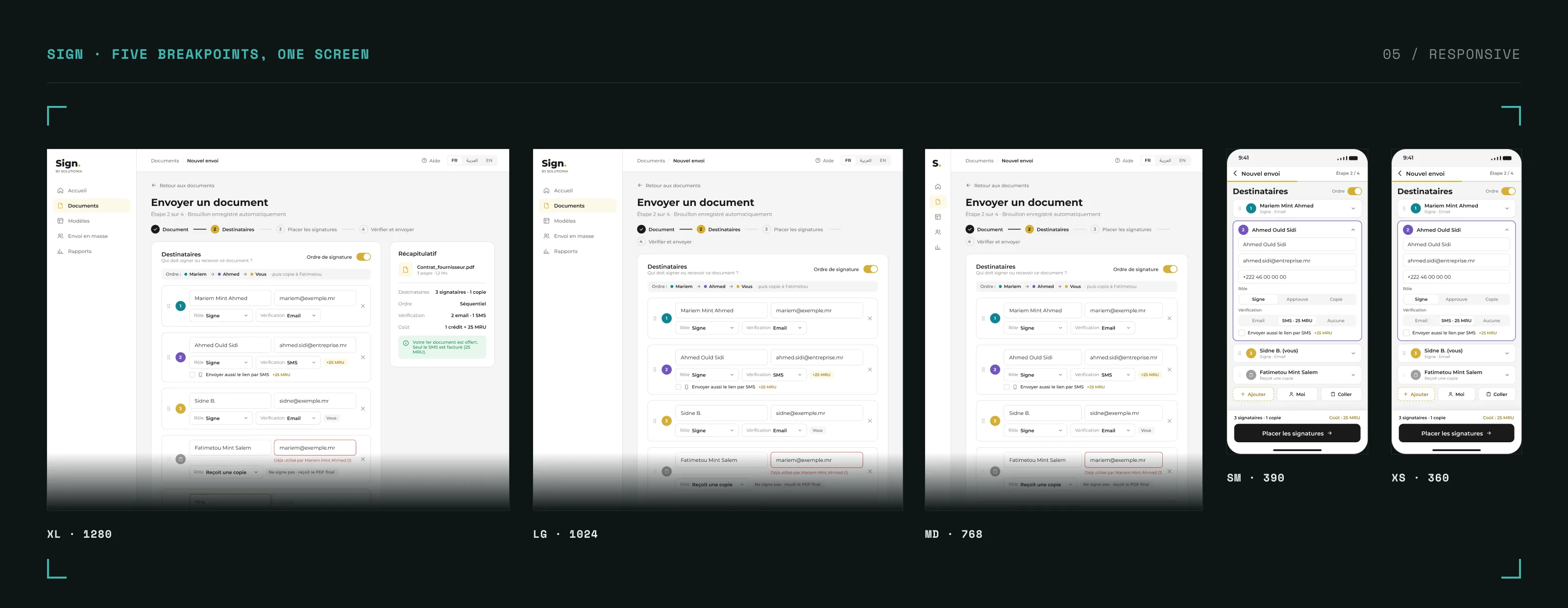
50 variables (colours, spacing, radius), text styles including Arabic, effect styles, and 13 components with variants. Every colour on every screen is bound to a token. Five breakpoints, from 360 to 1280 px, with written rules for each pattern.
A handoff written for developers and their AI
The handoff is the file, a clickable screen index, and a specification where each screen has an ID, a route, exact labels, states and acceptance criteria, plus business rules, a data model and a QA checklist tied to the audit findings.
| Flow | Desktop | Mobile |
|---|---|---|
| Public site and account | 4 | 4 |
| Documents and templates | 2 | 2 |
| Sending a document, including bulk send | 7 | 7 |
| Tracking | 2 | 2 |
| Signer, including three verification paths | 13 | 14 |
| Documents delivered after signing | 2 | 2 |
| Total | 30 | 31 |
The badge tells the truth.
"Identity verified" appears only after a validated code or an approved identity document. Without verification, the signer sees a neutral "personal link" badge.
Block the send, not the signature.
An incomplete document can't leave the sender. Catching it after signature would mean a legally signed document with blanks.
The signer never sees the sender's account.
A failed SMS is the sender's problem to know about, not the signer's. The signer gets a neutral message and an email code; the sender gets an event in the activity log.
Keep what users already know.
The live product places signatures by clicking on the page. On mobile, the redesign keeps that gesture as a tap. Automatic placement exists in the market, but stays an option until it's proven feasible here.
Ship less, with a reason.
Date, name and free-text fields were removed from the first version: no observed need, and the date already sits under the signature. Initials stayed, because the product already offers "initial every page".
One proof, one format.
The certificate has no mobile layout. A phone opens the A4 PDF in its viewer, and there is never a second version of the evidence.
Claude, through the Figma MCP, built and edited the screens by script on the design system's variables, styles and components. After each change, every frame was checked automatically for elements overflowing their parent, and for desktop screens missing their mobile version. The same assistant drafted the audit, the summary and the handoff spec from my test captures.
What stayed human: running the real tests, deciding what each capture proved, every trade-off above, and each answer to the client. AI also made mistakes I caught in review: findings based on a scrape that couldn't run animations, a claim built on a partial screenshot, and a token binding that silently made translucent signature zones opaque.