SigNusk
Signusk is a bilingual UX experience designed to help Hajj &
Umrah pilgrims stay connected and navigate large crowds safely.
Lost in a crowd of millions
Every year, more than 2 million pilgrims gather in Makkah. They travel in groups — sometimes 200 people. But there was no reliable way to know if someone was drifting away — until it was too late
A group of 100 pilgrims. A crowd of 2 million people. One leader. No tool.
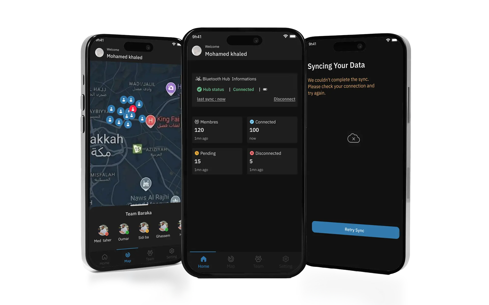
Real-time visibility. For every member
SigNusk combines Bluetooth tags worn by each member with a GPS-powered mobile app — giving the Leader complete real-time visibility of their entire
group, at any scale.
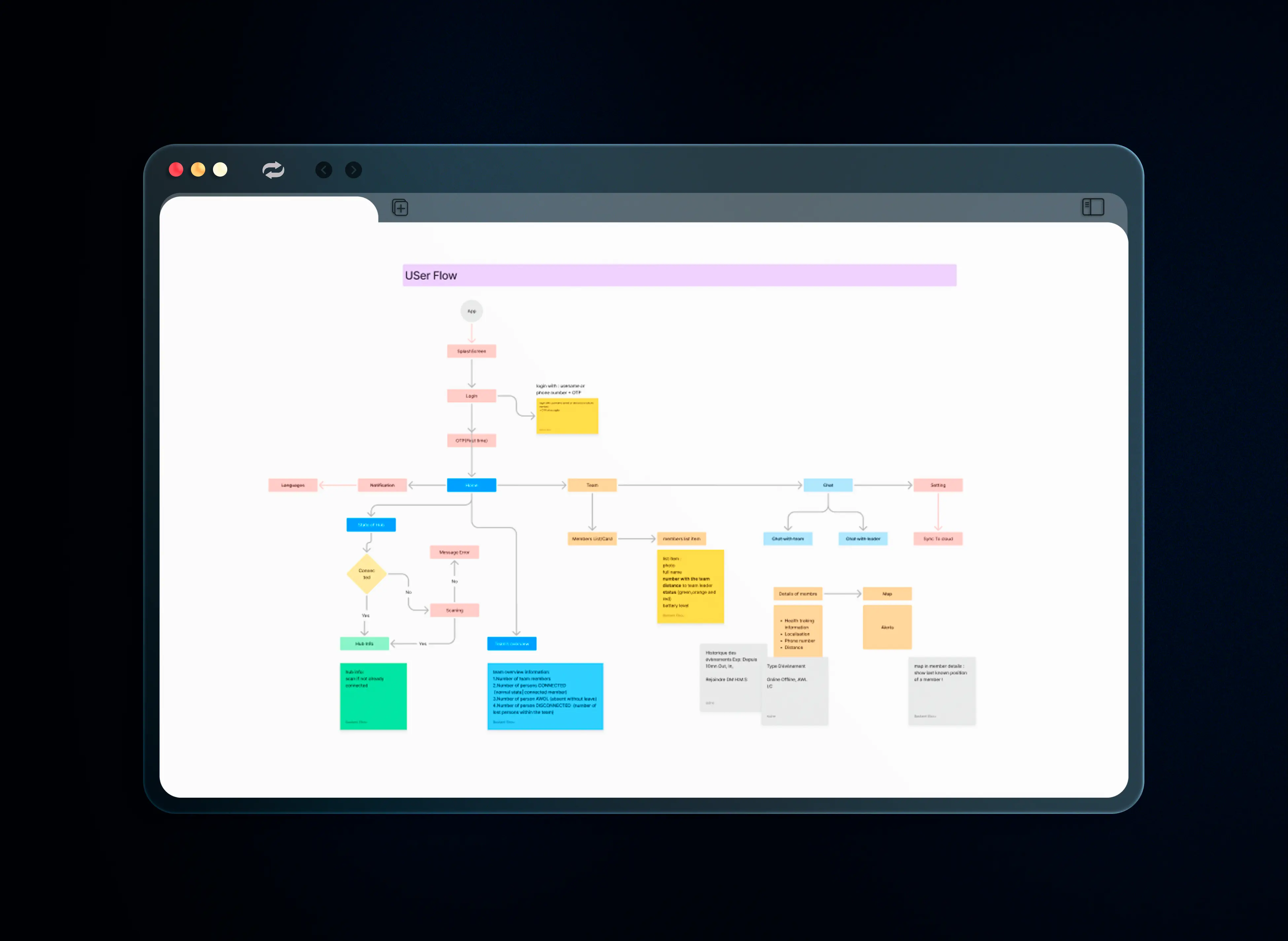
User Flow & Architecture
Before opening Figma, I mapped the complete app architectureto align the entire team on scope and navigation.
The user flow focuses on three key actions:
Join group → Track members → Navigate together
MoSCoW Prioritization
To define a clear MVP and avoid scope creep, I ran a MoSCoWsession with the team — separating what the app must do fromwhat can wait for V2.
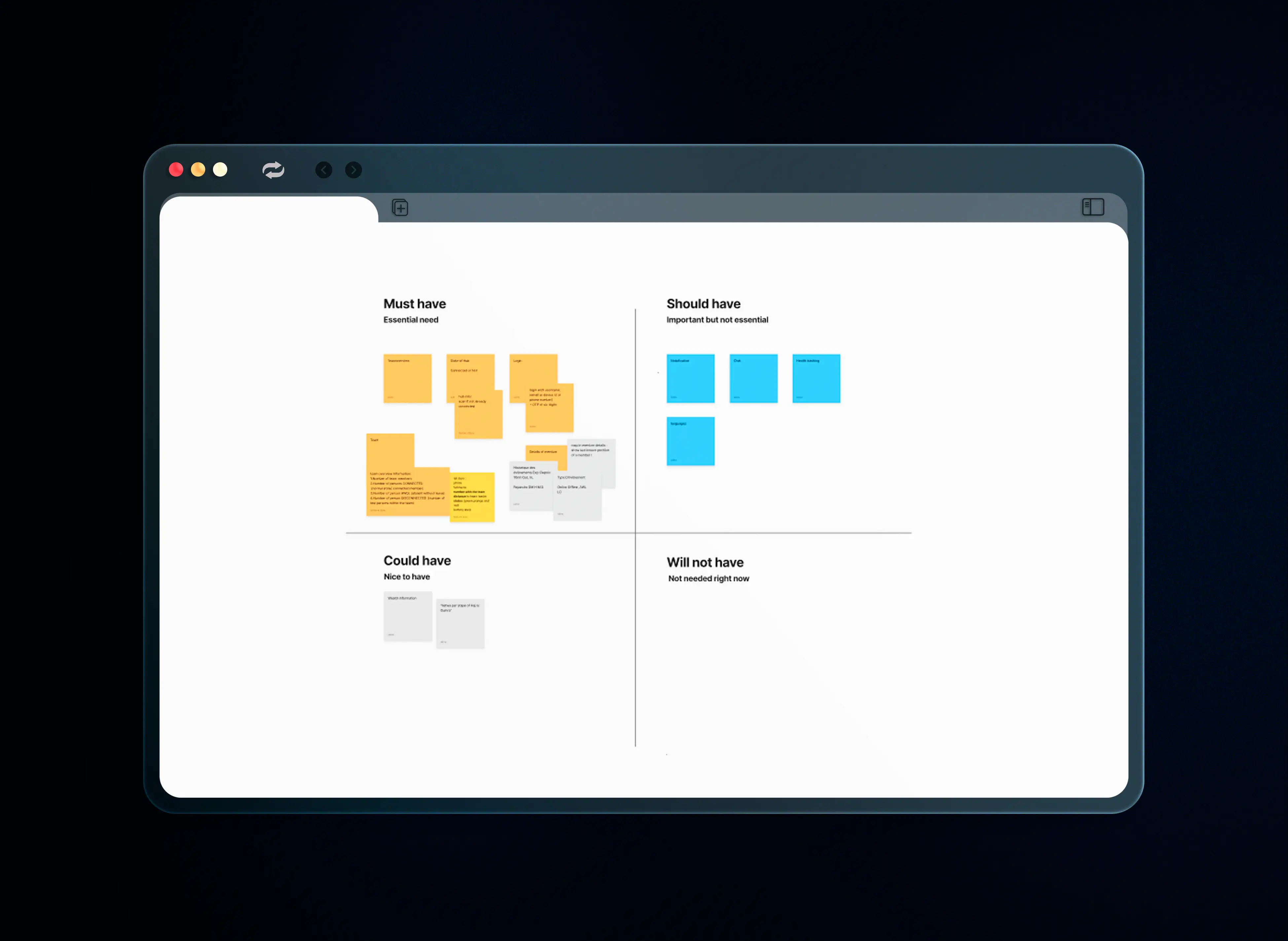
Must Have
Team overview · Hub state Login · Member list · Map
Should Have
Notifications · Chat · Health tracking · Languages
Could Have
Wealth information Fetwa per step of Hajj
Will Not Have
Out of scope for V1
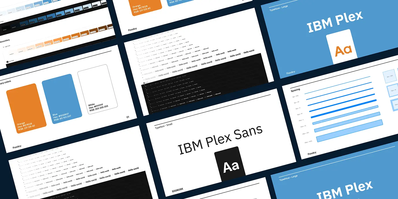
UI Design with Gluestack
The interface was built using the Gluestack design system to ensure scalability and efficient developer handoff.
Color coding for universal understanding
Green = safe · Orange = warning · Red = danger. No text needed to understand the status. Works across all languages and literacy levels.
Bilingual AR/EN from screen one
The language switcher is visible on screen 1 — not buried in settings. For pilgrims from 180+ countries, language access is a safety feature
Timestamp on every member
"6m Ago" vs "Now" — a small detail that makes the difference between calm and panic.
Battery indicator on each tag
A dead tag = an invisible member. Showing battery level proactively prevents the worst case scenario.
Gluestack UI for dev handoff
Every screen was designed to be buildable — no design-dev gap. Faster handoff. Fewer surprises in production.
Learnings
Designing for safety means every pixel matters. One missing alert = one lost person.