BIMBANK
An unsolicited redesign of BIM BANK — Mauritania's leading Islamic bank. From a broken sitemap to a fully responsive UI designed to earn institutional trust and convert visitors into clients.
A bank that didn't look like one — or act like one online
BIM BANK is Mauritania's leading Islamic bank — an established institution managing 50,000+ clients across 25 branches. But their website told a completely different story. Outdated design, broken information hierarchy, no trust signals, and zero conversion paths. In financial services, trust starts the moment someone lands on your site. Theirs lost it immediately.
A bank that looks unprofessional online loses clients before they ever walk through the door — and in Islamic finance, trust is everything.
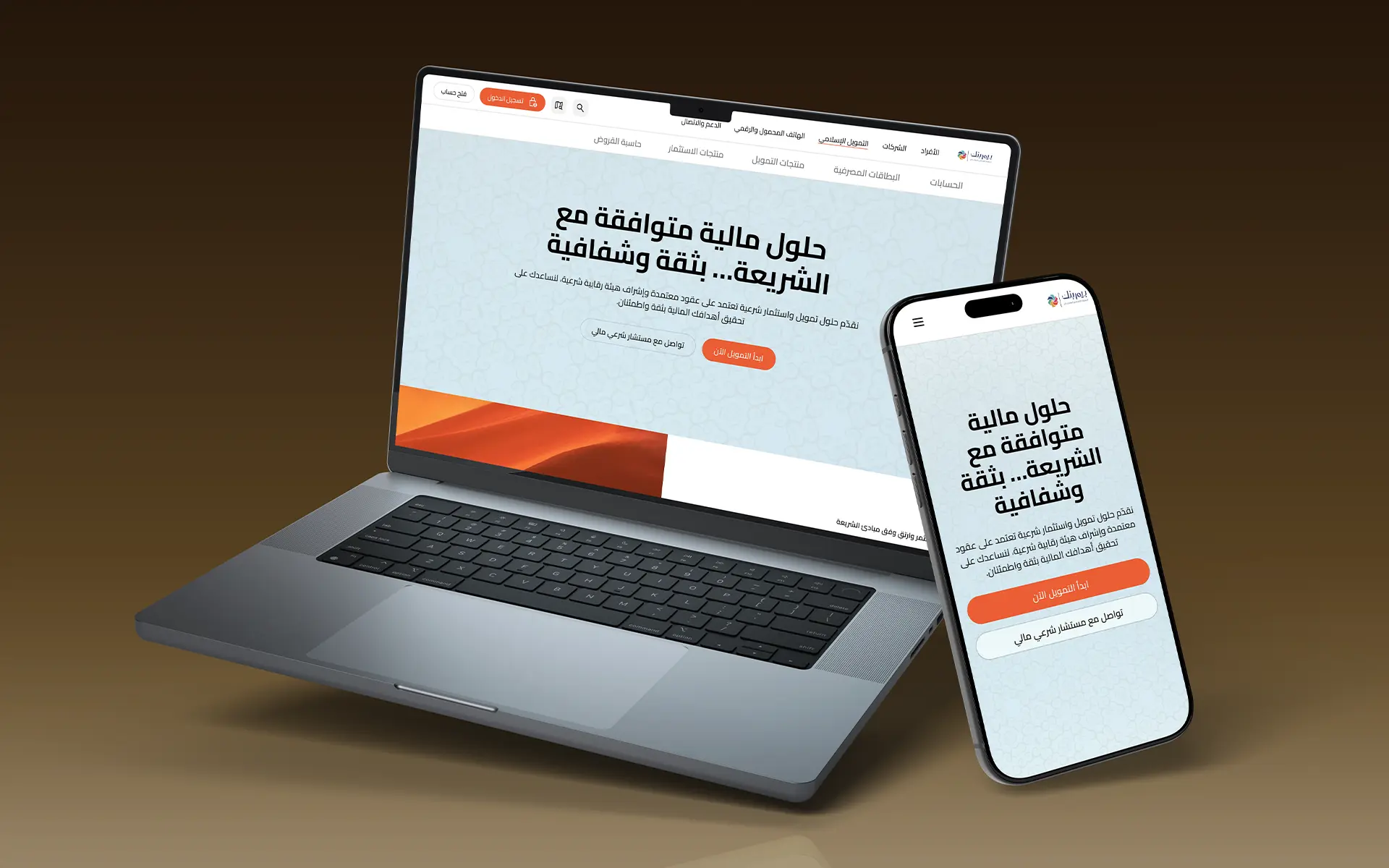
A digital presence that earns trust before a single word is read.
Full end-to-end redesign — starting from a rebuilt sitemap and user journey mapping, through wireframes, to high-fidelity responsive UI in Figma, and native Webflow integration. Every decision was made to reflect BIM BANK's institutional credibility and drive measurable action.
Analysis of the existing site
Before touching Figma, I audited bim-bank.mr against Nielsen's 10 heuristics and benchmarked it against Gulf Bank and Boubyan Bank — the regional references for Islamic banking UX. Key findings : no conversion paths, fragmented FAQ across 3 separate entries, no branch locator, no login button in the nav, and a homepage with 12+ sections creating cognitive overload.
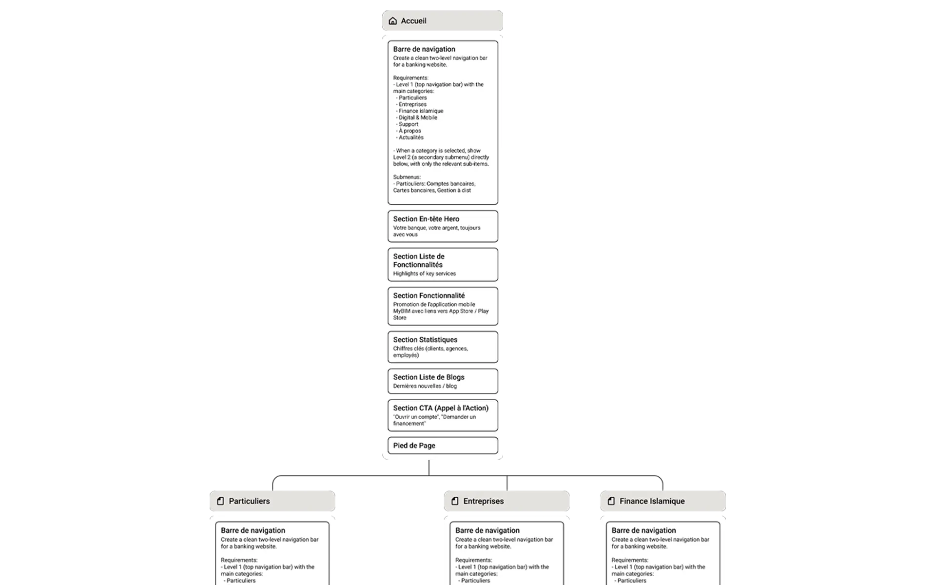
Sitemap Restructure
I rebuilt the information architecture from zero. Islamic Finance was elevated from a subcategory to a primary navigation pillar — a strategic decision reflecting the Mauritanian market. The new sitemap introduced pages that didn't exist : Branch Locator, Careers, unified Help Center, and a dedicated Mourabaha calculator. Every sub-menu item was mapped to an anchor section, allowing phased content delivery without breaking the user journey.
UI Design · Responsive
With the architecture locked, I designed 10 pages in Figma — desktop and mobile — using Relume as a component foundation, then customized into a full design system aligned with BIM BANK's brand. Every page follows a strict conversion pattern : Hero → Trust signals → Product features → Calculator CTA → Footer. The design was then integrated natively in Webflow with RTL Arabic support, custom JS for the Mourabaha calculator, and Finsweet for CMS filtering.
Segmentation before everything
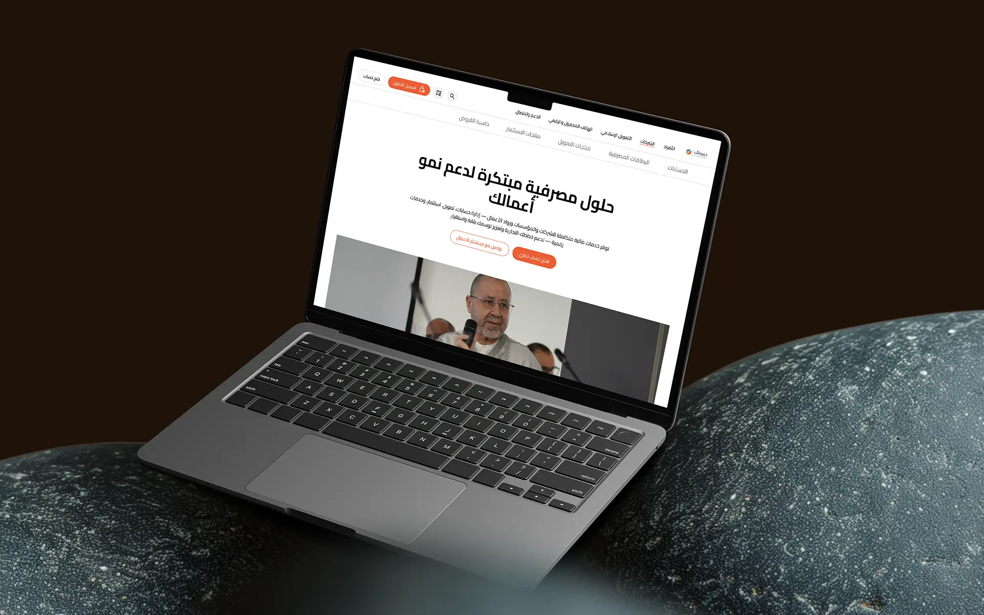
The existing site treated every visitor identically. The redesign introduces three distinct primary navigation pillars — Particuliers, Entreprises, Finance Islamique — each with its own product hierarchy, conversion path, and tone. A user looking for a Mourabaha loan and a business owner looking for SME financing have nothing in common. The navigation now reflects that.
Trust signals reframed
The bank had real credibility — 50,000+ clients, 25 branches, 500+ employees — but none of it was visible on the site. I moved these figures into the hero section, directly below the headline. Framing institutional scale as the first thing a visitor sees transforms perception before a single product is read.
Orange used with restraint
BIM BANK's orange (#E8500A) is a strong brand asset — but when applied to every element, it becomes noise. I restricted it to primary CTAs, key highlights, and section accents. Every other interactive element uses outline or text variants. The result : when orange appears, it means action.
Mobile-first responsive
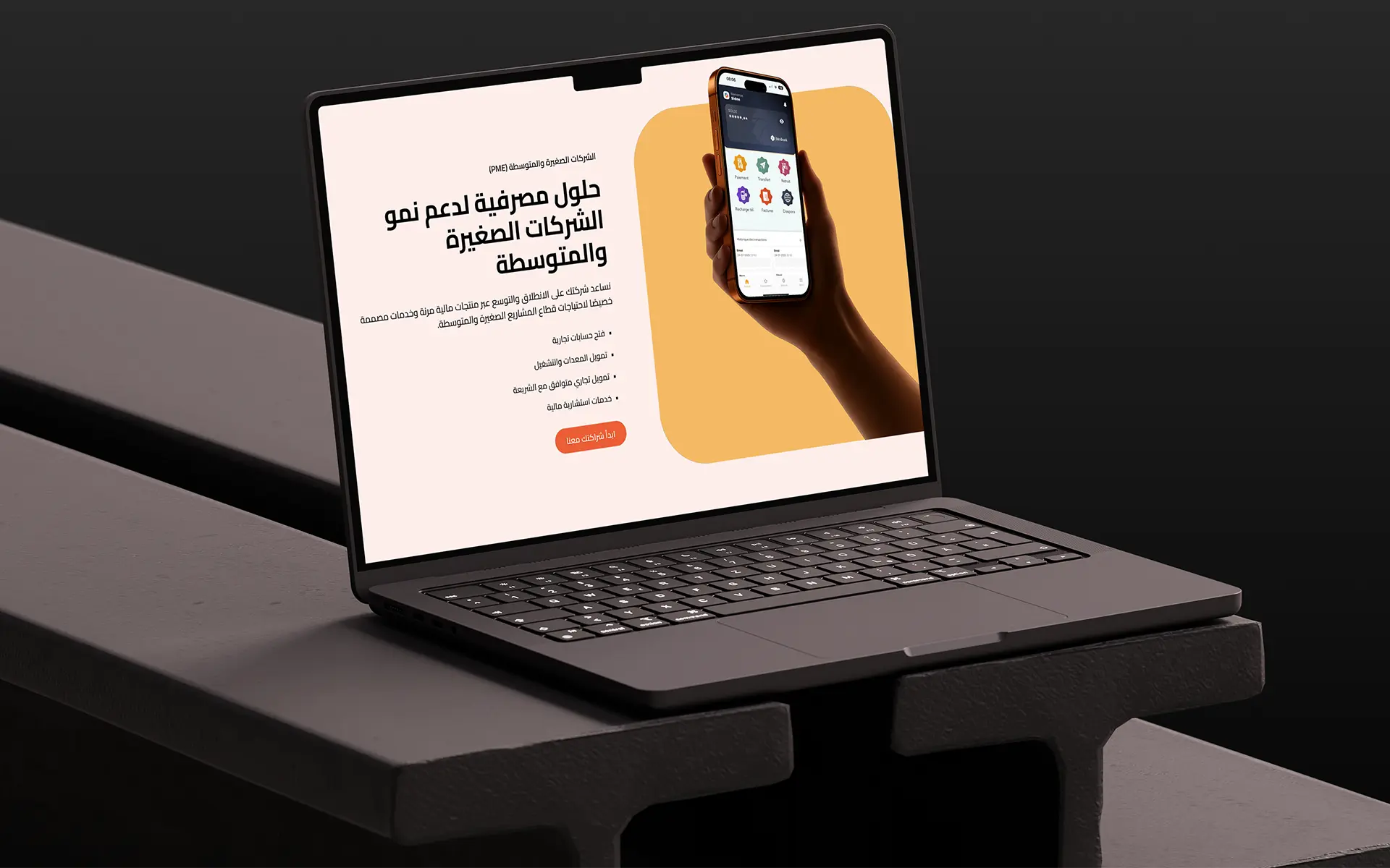
Mauritanian users overwhelmingly access financial services on mobile. Every page was designed mobile-first, with a "See more" pattern to reduce section density on small screens, a maximum of 7 sections per mobile page, and RTL Arabic applied across all 4 Webflow breakpoints. Desktop was the enhancement, not the baseline.
Sitemap before screens
A visually polished UI on a broken structure is still broken. The sitemap was the first deliverable — mapped, iterated, and validated before a single frame was opened in Figma. This single decision saved weeks of redesign and prevented scope creep during the UI phase.
Islamic finance as a feature
In Mauritania, Islamic finance isn't a niche — it's an expectation. The redesign elevates it from a buried subcategory to a primary navigation pillar with its own dedicated pages, a Sharia Board presentation, product-specific FAQs, and an interactive Mourabaha calculator. This positions BIM BANK's Islamic identity as a competitive differentiator, not an afterthought.
Learnings
In financial services, design isn't decoration — it's the first trust signal a client encounters.